
DHAHAB · ذهب · The Golden Standard
The lion mark
One mark for everything I ship — the site, the apps, the products, the clothing label. It is drawn by a program, not by hand, so a change to the geometry reaches every surface on the next build.
lion-mark.svg · gradient gold on near-black · 256 × 256 artboard
01 · Why
King, sword, gold — in one figure.
Two brands, two languages, one silhouette that carries both.
My clothing label is KXNG SEF: king, plus سيف — Arabic for sword, and the nickname I have had since childhood. My studio is DHAHAB: ذهب, gold. A lion's mane is the one figure that carries both without needing a word in either language. It also survives being shrunk: at 16 pixels a monogram turns to mush, but a mane silhouette is still a mane.
02 · Construction
Three decisions do all the work.
Everything is generated from one Python file. These are the parts that took the most iterations to get right — and the failure mode each one prevents.
The mane hangs
Shard length is a function of angle — cropped over the brow, heaviest at the jaw, with two low harmonics for an organic outline. A constant radius does not read as a lion. It reads as a sun.
The shards vary
Lengths carry a deterministic jitter. Identical petals at even spacing read as a flower, not a mane — same reason a hand-drawn mane is never symmetrical.
The muzzle falls
A philtrum line under the nose and lobes that drop away. Lift those lobe ends by a few units and the whole mark turns into a smiley face. This is the single most fragile detail in the design.
03 · Colour
Gold on black, or ink on bone.
No third colourway. The gradient runs light to dark, top to bottom, and never rotates.
The ramp behind it
One hue family, eight stops, so no page ever has to invent a gold. Ratios are the measured worst case across the four dark surfaces the site uses.
Every ratio above was measured with the WCAG 2.x formula against the four dark surfaces the site actually paints, and the worst of the four is the one quoted. Two stops are disqualified from ever holding text: --gold-700 is paper-only and --gold-800 is decorative. A gold that looks right and fails a reader is not on brand.
04 · Type
Three faces, none of them downloaded.
The site makes zero external font requests, on any page, ever. Everything below is a face your machine already had.
The Golden Standard
Display serif — headlines only
"Iowan Old Style", "Hoefler Text", "Apple Garamond", Palatino, "Palatino Linotype", "Book Antiqua", Georgia, "Times New Roman", serif
Earned. Never given.
Display sans — section heads, buttons, labels
"Inter Tight", Inter, -apple-system, BlinkMacSystemFont, "Segoe UI", system-ui, sans-serif
#D4AF37 · 8.08:1
Mono — figures, hex values, captions, receipts
"SF Mono", ui-monospace, Menlo, Consolas, monospace
The honest cost of that rule: I do not control which face you are reading. The serif above resolves differently on macOS, Windows and Linux, and on an unlucky machine it lands on Times New Roman. That is the trade — a page that renders instantly and phones nobody, in exchange for a specimen I cannot guarantee. I take it every time.
05 · Variants
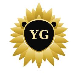
Four marks, one geometry.
Pick by surface, not by taste. Every file below is an SVG you can open and inspect.


06 · Lockups
Mark plus wordmark.
The canvas sizes itself to the word, so a long name never overflows its own artboard.
07 · Scale
It has to work at favicon size.
Below 24px, switch to the tile — the loose shards blur into a blob without a container.

08 · Rules
Five, and they are not negotiable.
Written down because a rule you keep in your head is a rule you break at 2am.
- Two colourways only. Gold on black, or ink on bone. Never a third.
- Clear space of one ear-width — about 12% of the mark — on every side.
- 24px minimum for the master mark, 16px for the tile. Below that, use the tile.
- Never recolour individual shards, add an outline, stretch it unevenly, or drop it on a busy photo.
- On garments the lion takes the gold only when it is the largest graphic with no competing hero word. Beside a giant word, it prints bone like any other supporting element — the same one-hero-element rule the crown follows, with no carve-out.
09 · The kit
Everything, in one download.
Every SVG variant, both lockup sets, the profile avatars, the header banners, and a one-page rules file.

inset so a circular crop never clips the mane

for light-mode profiles and print directories
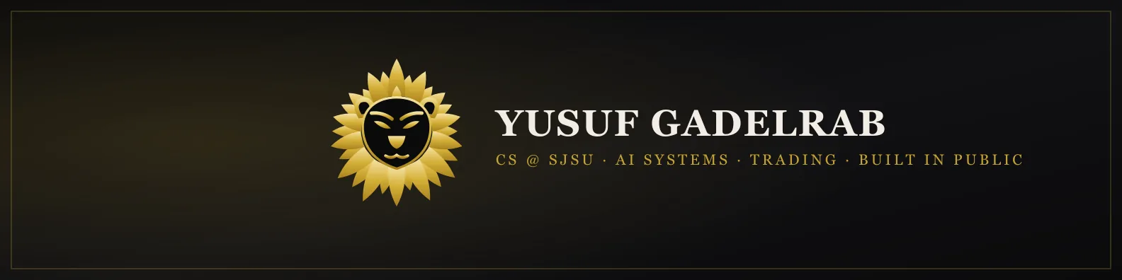
lower-left kept clear for the profile photo
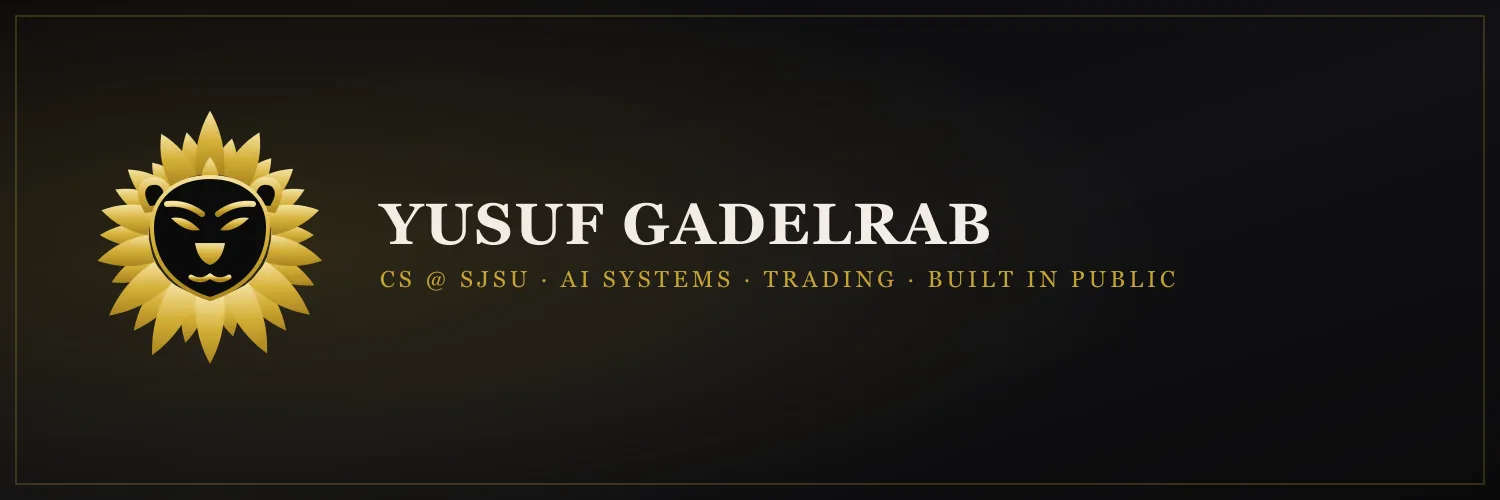
The mark is my identity — use it to refer to me or my work, not as your own brand. That is the whole licence — there is no longer version. The download sits at the foot of this page.
10 · Where it lives
One generator, every surface.
Three places the same source file ends up, unchanged.
The apps
TradeLog, Cut, Fire and GRAMPA carry the mark in-app and as their installed home-screen icon.
Open the apps →KXNG SEF
A print file at full garment resolution, with the face knocked out so bare fabric reads through instead of ink.
See the label →The products
Every PDF cover in the store is stamped with the same mark from the same source file.
Browse the store →Take the mark with you.
Every SVG variant, both lockup sets, the avatars and the banners — one ZIP, no signup. Writing about the work instead? The media kit has the approved copy.